Universitetsavisen
Nørregade 10
1165 København K
Tlf: 35 32 28 98 (mon-thurs)
E-mail: uni-avis@adm.ku.dk
—
Campus
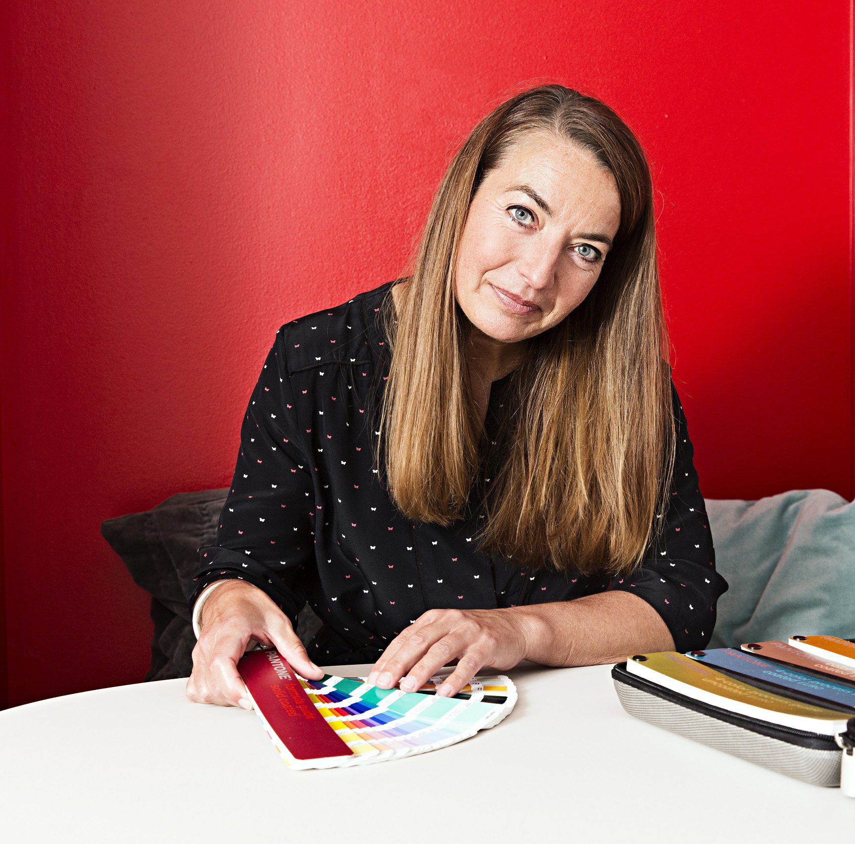
My job — Signe Lund-Sørensen designs graphic solutions for the UCPH web pages
Signe Lund-Sørensen has a thing with colours.
“Fortunately, I was allowed to go bananas,” she says, smiling at the red wall, which has gave the small, curved impossibility of a flex room a warm and tactile quality.
We are high up, under the rooftop dormers of Nørregade, where the University of Copenhagen’s (UCPH) central communications department is located. Here 20 people are responsible for the university’s internal and external communication. And here Signe is a designer, mostly working on good graphic solutions for UCPH online communication.
Designer Signe Lund-Sørensen
50 years of age. Employed in communication in the central administration since 2009, where she is currently on the web team. Educated at the Danish School of Design in both textile and industrial design. Has previously worked with graphic design in various companies and as a freelancer. When she is not at work, she volunteers for the International Child Welfare Service, and is a big consumer of theatre, art exhibitions and performance art. This year, her holiday was a trip to the Documenta art exhibition in Kassel. She is a member of the SPEAT club, where they both play sports and eat together.
It’s not a simple task, according to Signe, to keep the university’s web design in line. The users are spread across six faculties, and they need to be heard and to approve new development initiatives in different forums, before they are sent out of the Nørregade centre:
“When choosing a new font, for example, it’s not enough to go for something that’s the current trend, because we always have to think in solutions that will make it easier for the many web editors out there. We work hard to make it easy for users to do a good layout.”
The university got its first draft of a common visual identity in 2000. Three years later, a digital design manual was launched, says Signe, and the goal is to have a university with a common graphic expression on web and on print.
“The purpose of the design guide templates is to make it easy for the users to concentrate on content. And there are templates in set up with graphics with the university logo for Word, Powerpoint and other programmes that students and employees need,” the designer says. She is one of the three people responsible for the guide.
While Signe explains that she and her colleagues do not want to be perceived as a kind of design police, we zoom out to the open-plan office.
It is always just a bit more elegant where people work with visual communication. This is no exception. Here we have footrests upholstered with blue and red wool. Thick design bibles on book shelves with spines in neon colours. And here is the department’s mascot, a plush version of the fascist hippopotamus dolph, a character in a Danish television show
The hippopotamus is known to set on people at the slightest provocation. In the web team, we try to do the opposite, Signe explains. It is all about constructive dialogue out in the many feedback communities in the faculties.
“We have just developed some new flexible boxes for web pages. The design should be able to stand the test of time and should work on both desktop, tablet and mobile. The challenge is to answer the very different needs of the web editors.”
When the University Post asks whether the university logo needs a graphic overhaul, Signe replies that she personally would prefer that the university’s
“After all the mergers, it was an advantage that we could offer each faculty its own seal and color. There are many emotions involved in this design and logo thing, and everyone has an opinion about the visuals.”